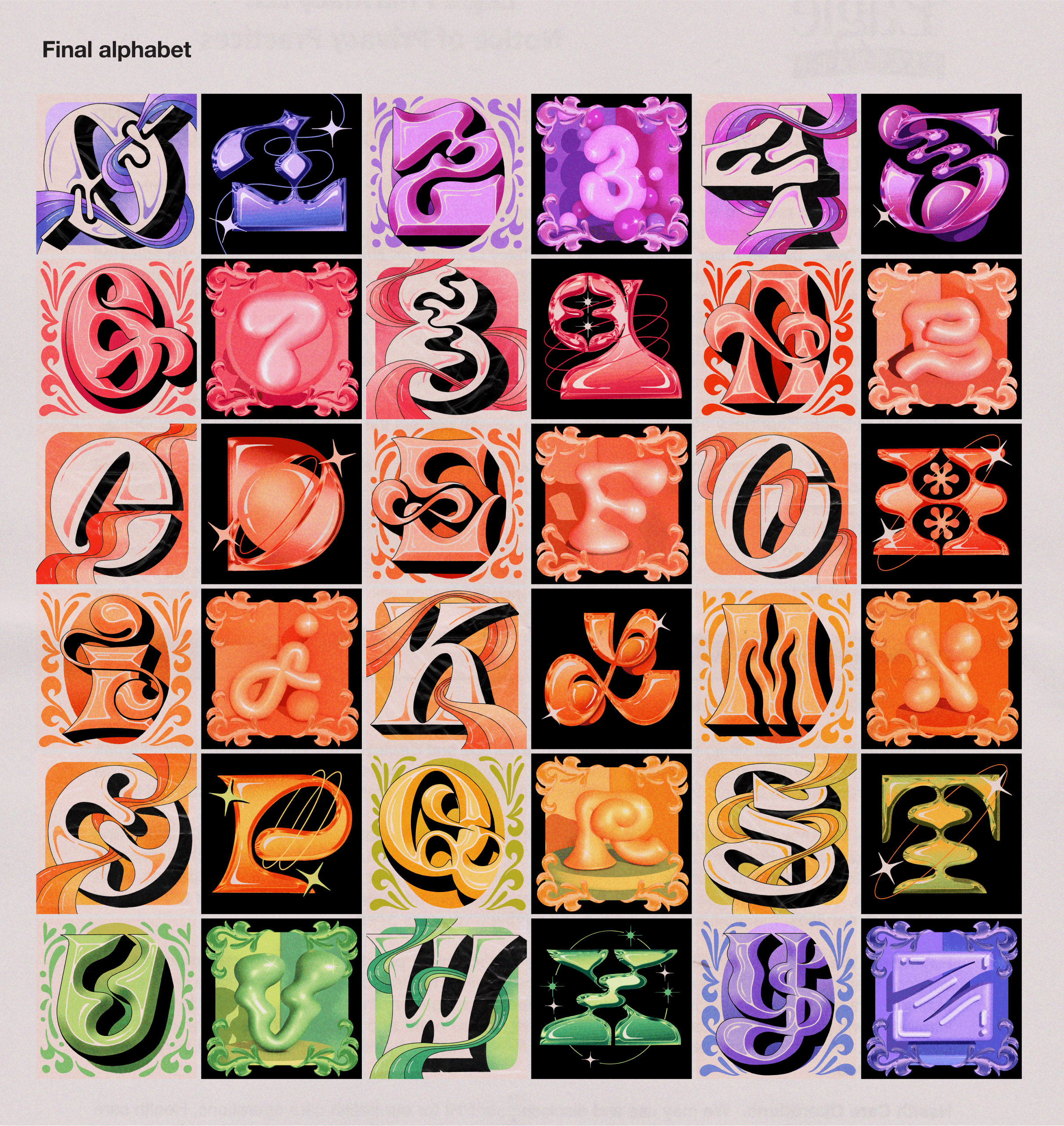
Alphabet 2
For my most recent alphabet, I was inspired by the interplay between nostalgic ornamentation and sleek futurism. Drawn to surrealism, sculpture, and intricate detailing, I wanted to reimagine them through a digital illustration lens. By integrating new software and workflows, like 3D modeling software, I also added a fresh dimension to my creative process.
I used an intentional color palette to create a gradient across the full final alphabet. To develop the final pieces, I used a workflow that incorporated Cinema 4D, Photoshop, Illustrator, and Procreate. My letter “D” was selected to be featured on
36 Days of Type and
Adobe Create on Instagram, and on
Adobe Discover, the editorial section of Adobe.
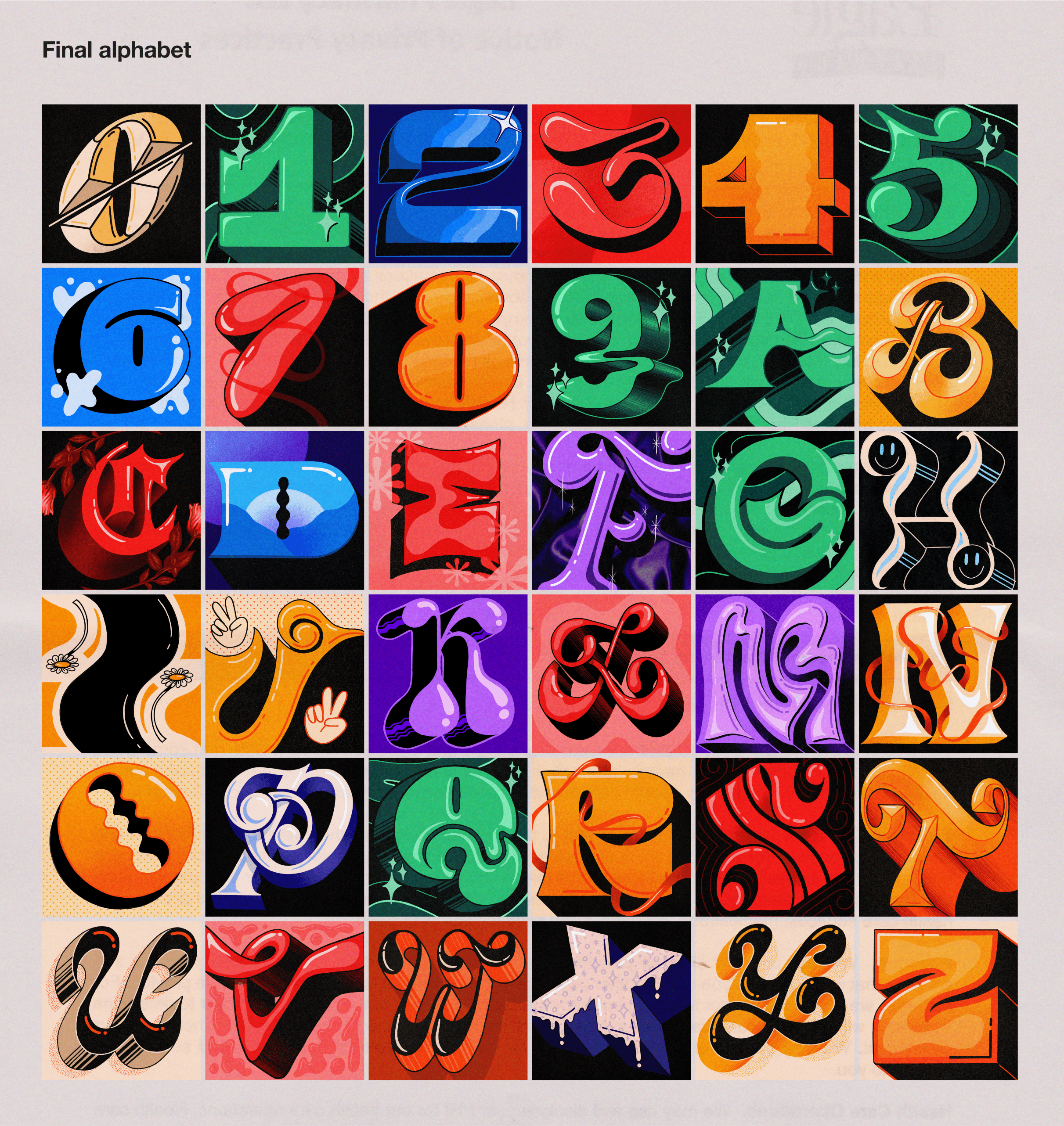
Alphabet 1
For my first alphabet, I drew inspiration from my grapheme-color synesthesia—a sensory condition in which I instinctively associate letters and numbers with specific, unchanging colors. Each letter in my alphabet is rendered in the color I perceive it as, while additional visual elements reflect the emotions and characteristics I intuitively connect with these colors. By embracing these associations, I shaped each letterform’s personality and the environment it inhabits.