Initial sketches
Logo iterations, from pencil sketches to rough vector
Process shots creating and refining the final vector lettering
Process
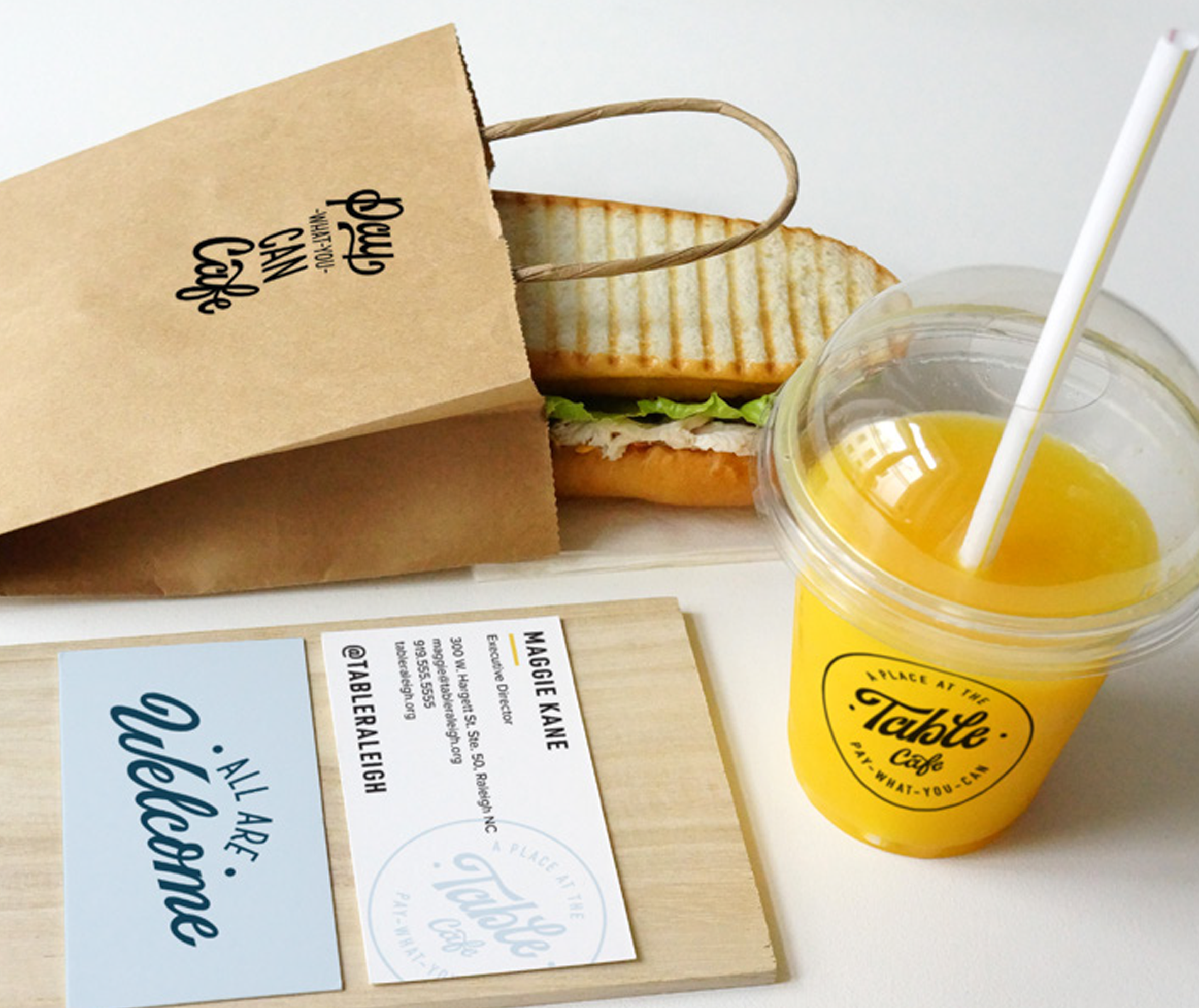
We went through three rounds of sketches and revisions to get to the final pieces. Knowing that one of the main placements for these assets would be on signage and objects around the cafe, we tried each iteration out on mockups of the placements in the restaurant to narrow down and align on refinements to be made.
The main pain points for A Place at the Table with their previous logo were that it was very inflexible, it was illegible in smaller formats, and the font used was a free font that wasn’t really ownable for them as part of their brand identity. This new logo needed to maintain that friendly, rustic feel of the cafe but be confident, bold, and flexible so that they could use it and scale it for many years to come.
Final main logo script
The final result was the main logo you see above, a badge-style logo for the signage at the Raleigh cafe, two alternative logos for use on things like merchandise, menus, and social media, and two additional hand lettered phrases to be used as flexible brand artwork - “All are welcome” and “Pay-what-you-can cafe”.


