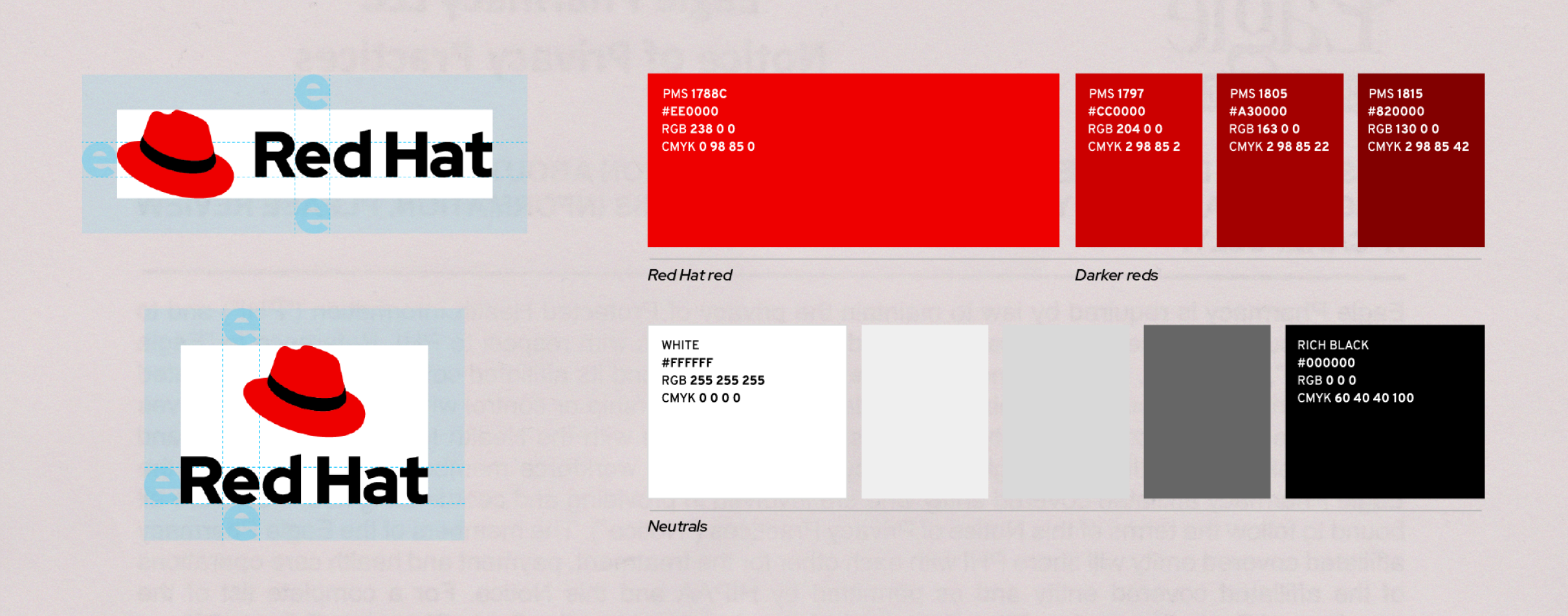
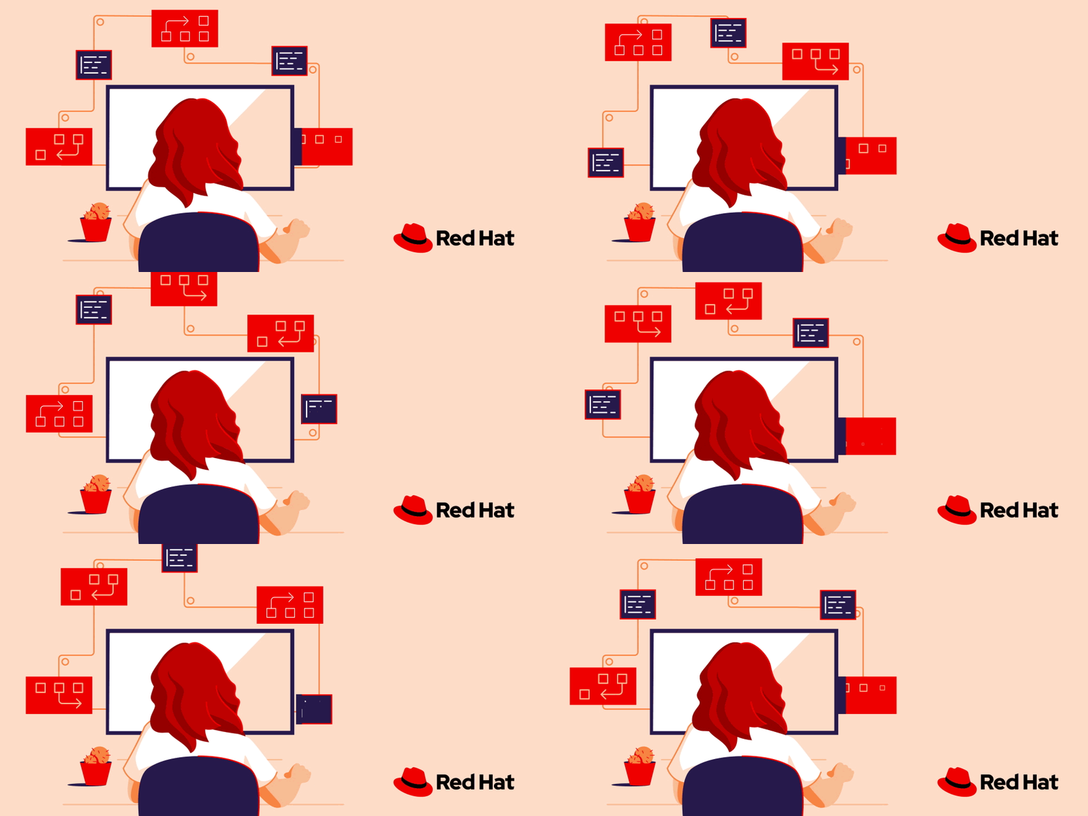
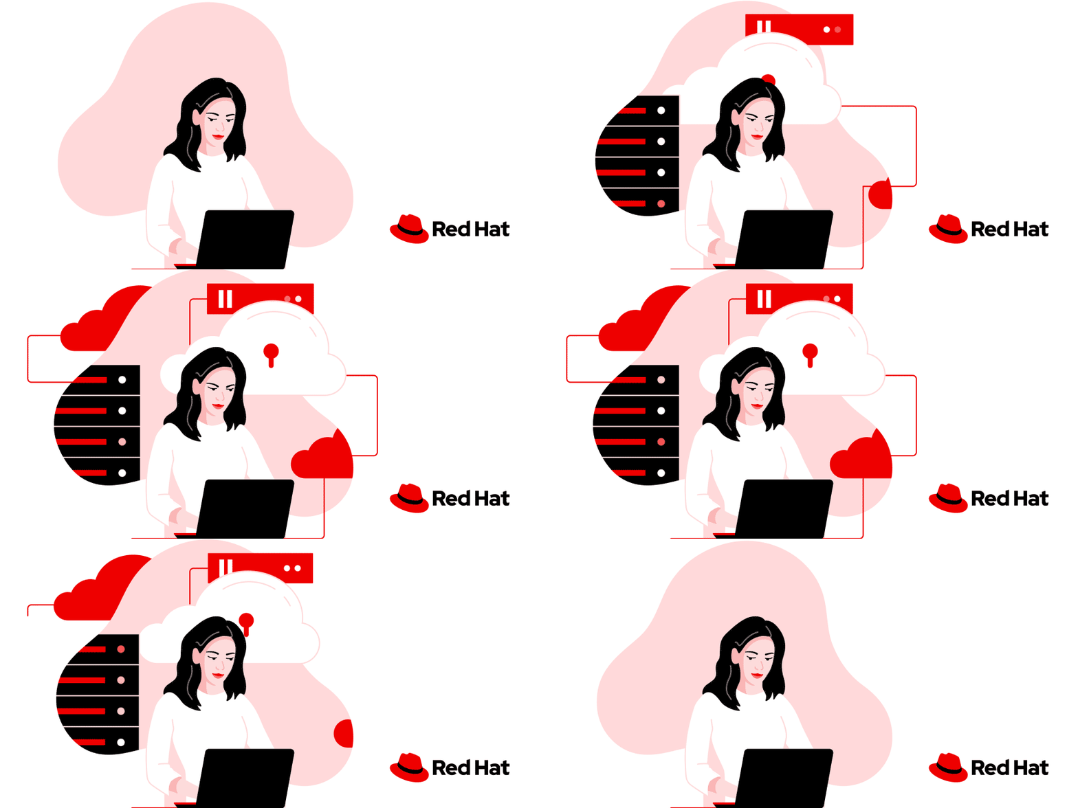
After the initial rebrand, only the logo had changed. Other visual elements like colors, photography, and illustration still reflected the old brand. We faced two challenges: transforming our ideas from pitching the rebrand into a scalable illustration style, and meeting high demand to replace outdated visuals.
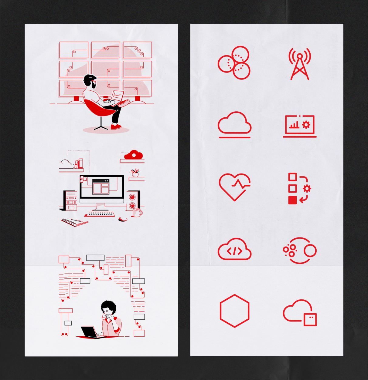
The illustrations we had created as part of pitching the rebrand used mostly a limited red-based color palette and needed to be adjusted based on early usage insights. For many of our technology topics, all we had was a single icon as the foundation to create a full suite of illustration assets at varying levels of scale and complexity.
Strategy & prioritization
Starting with a rough style frame and topic list, we partnered with account and project managers to prioritize based on real needs, using web traffic data, upcoming events, product launches, and active requests to guide what got created first.
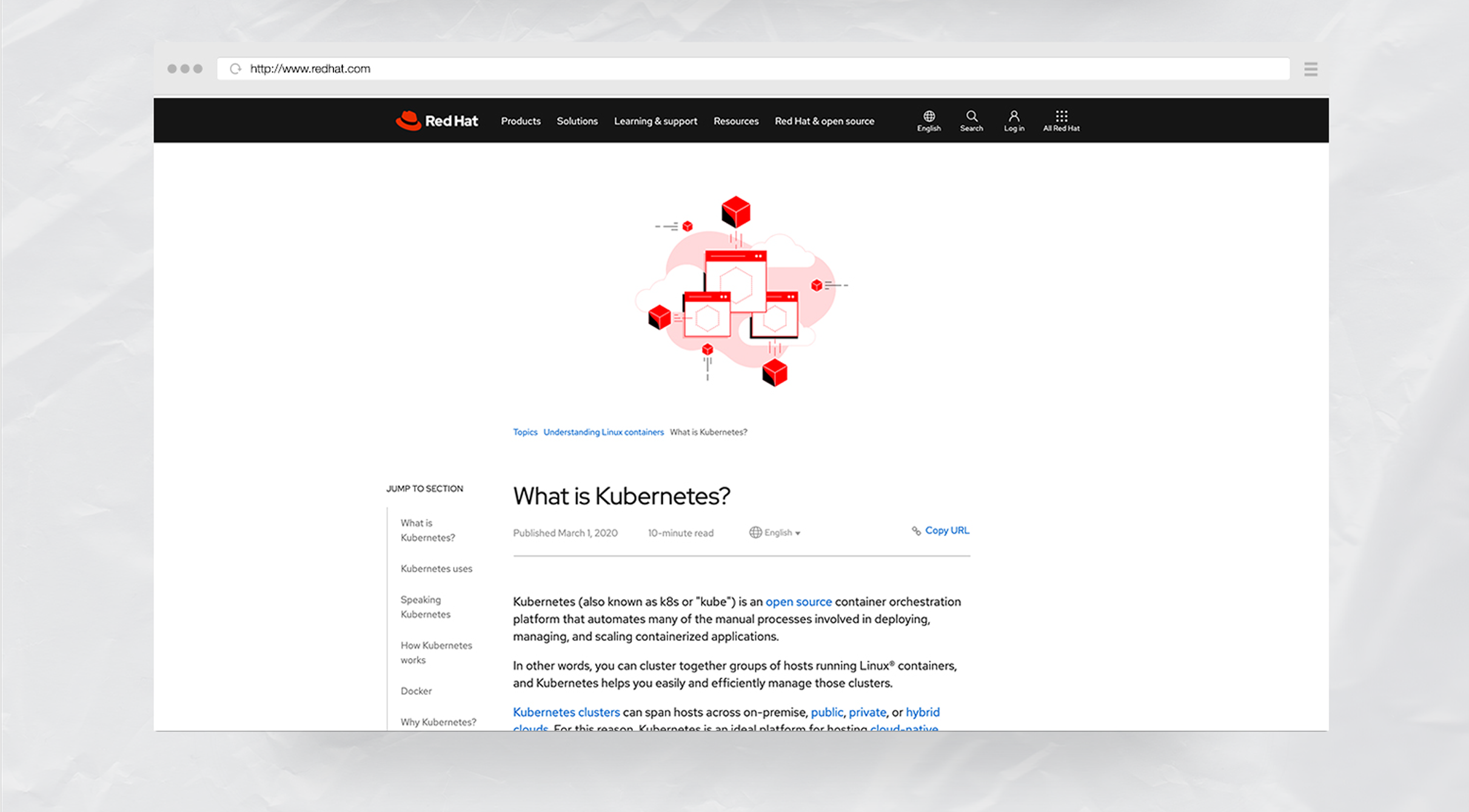
Account and project managers helped us bring in an agency partner to handle illustration work as I provided art direction. They also set a steady rhythm for developing and publishing batches of illustrations to the company repository.We collaborated with the corporate social media team to align on asset documentation and streamline reviews, while reinforcing our creative intake process to reduce one-off requests and boost bandwidth for the larger library.
Refinement & consistency
To address the problem of lack of consistency and need for refinement in our illustrations, we spun up two workstreams: one to refine style variations, and one to align on consistent visual metaphor for each of our tech topics.
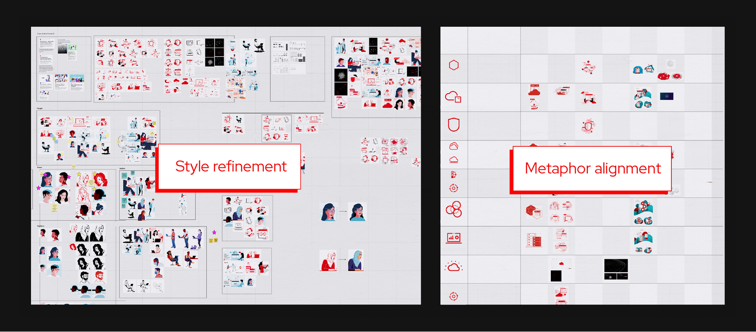
To refine our style, we reviewed as many illustrations as possible, identifying what worked and what didn’t. We conducted exercises where we made small adjustments to mismatched illustrations, bringing them into harmony with each other and the broader style. By documenting these changes, we provided clearer feedback to others, ensuring consistency across all illustrations.
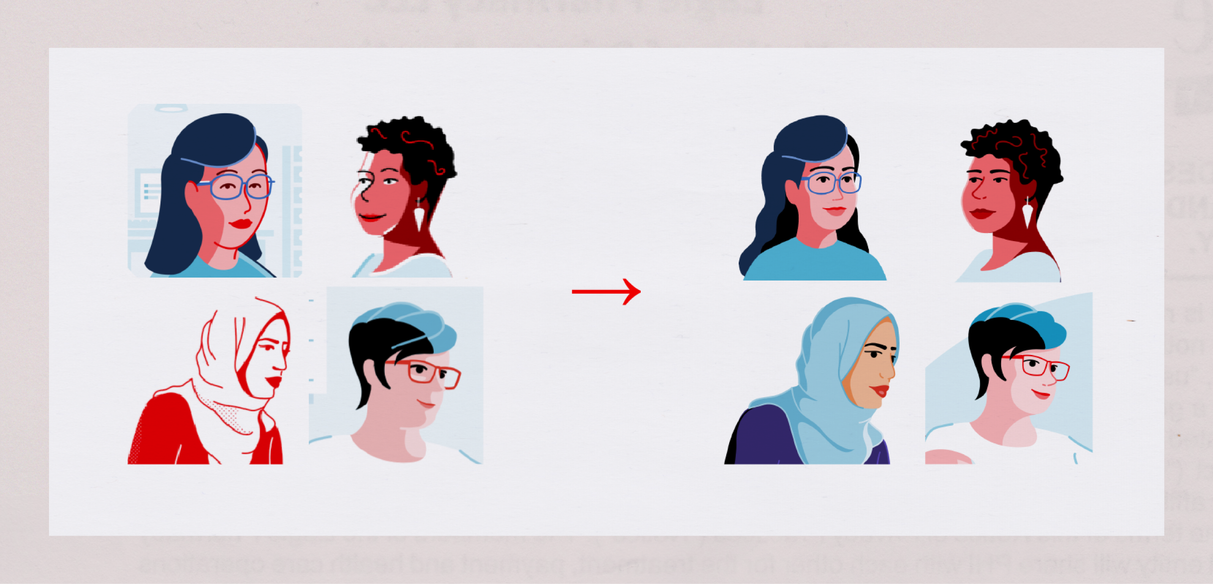
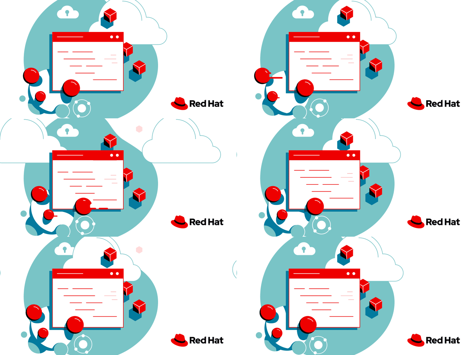
To refine metaphors, the team collected illustrations for each tech topic and used the icon as a foundation for consistency. In this example below, you can see that the representation of containers in each illustration has been changed to match the hexagon shape of the icon, rather than having some hexagons, some squares, and some shipping containers here and there.
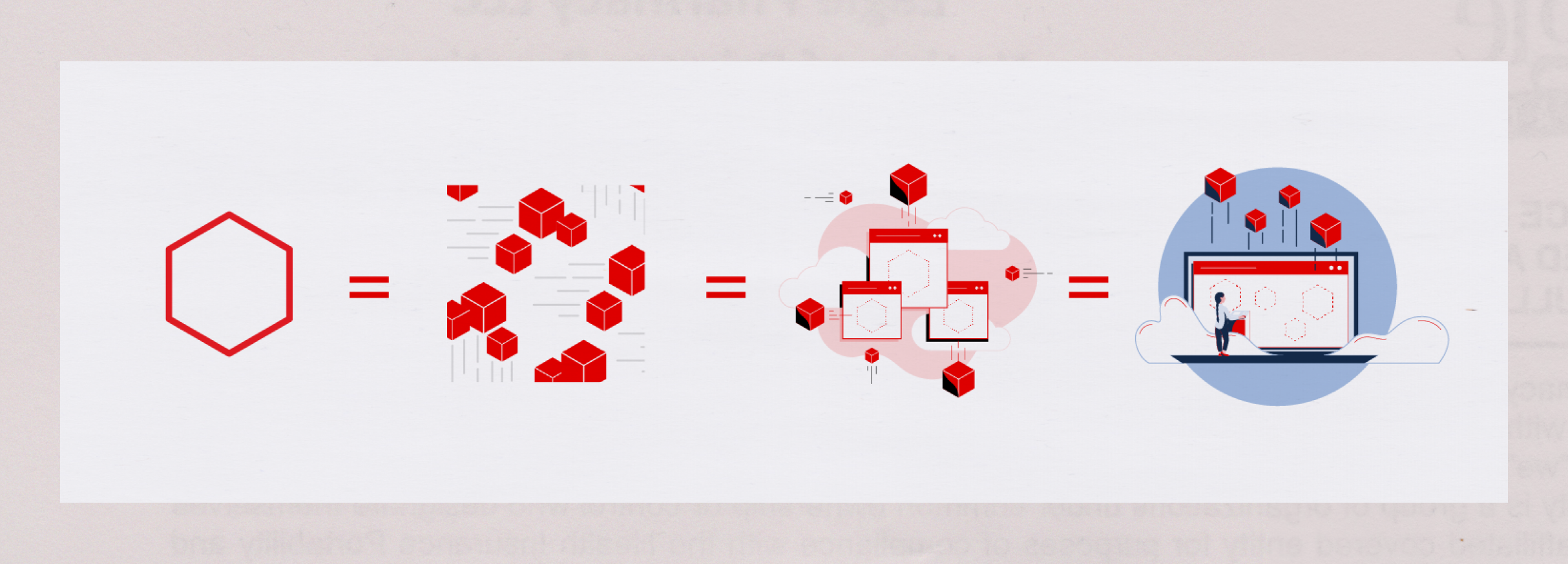
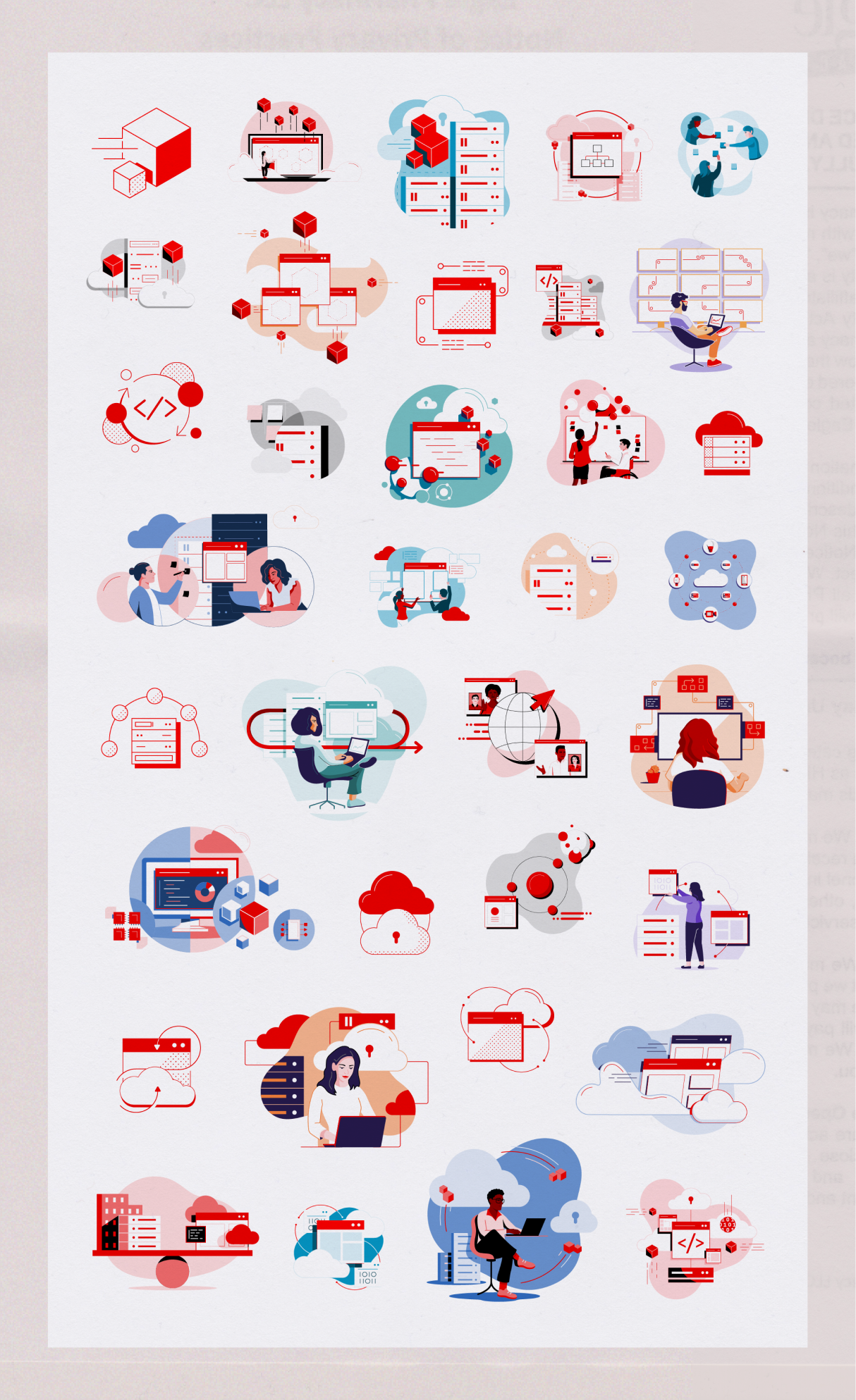
The end result? A library with consistent visuals across topics and a unified style, plus a ton of illustrations to choose from. This gave us a more cohesive brand, less time on one-off requests, and more time to focus on new ideas and keep improving.
Accessibility & organization
We set up a shared Google Drive with illustrations organized by topic and created a corresponding catalog deck with thumbnail previews for easy browsing. This made it quicker for teams like corporate social media to find the right graphic without having to dig through folders or make urgent requests.
We created illustration guidelines that reflected all that we had documented throughout the library project. We collaborated with UX designers and copywriters to format the guidelines for publishing on
brand.redhat.com. You can view the full illustration guidelines page
here.