Alphabet, 2nd Edition
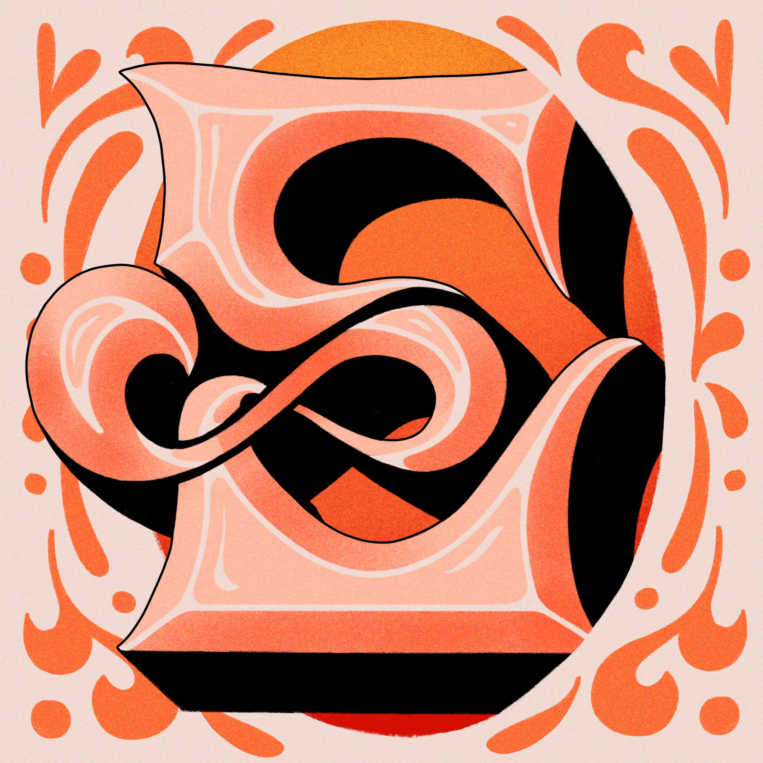
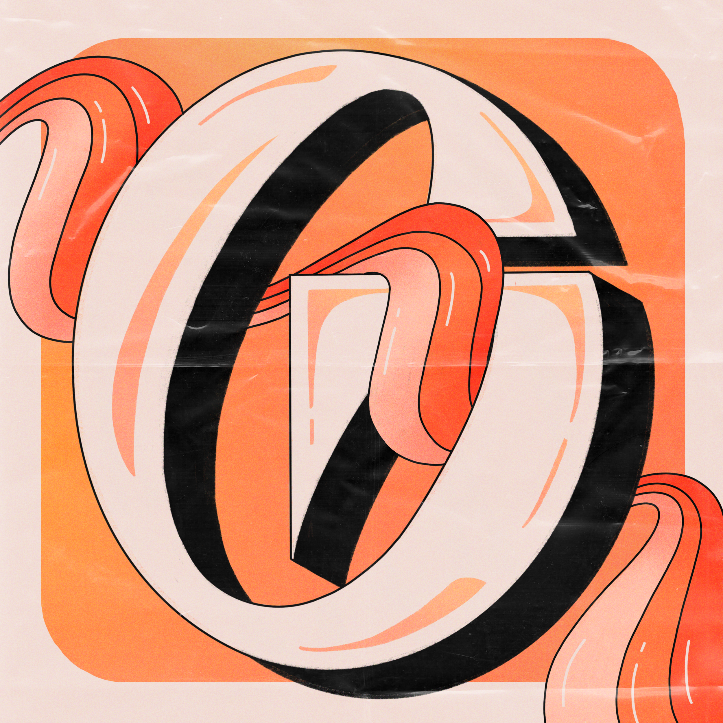
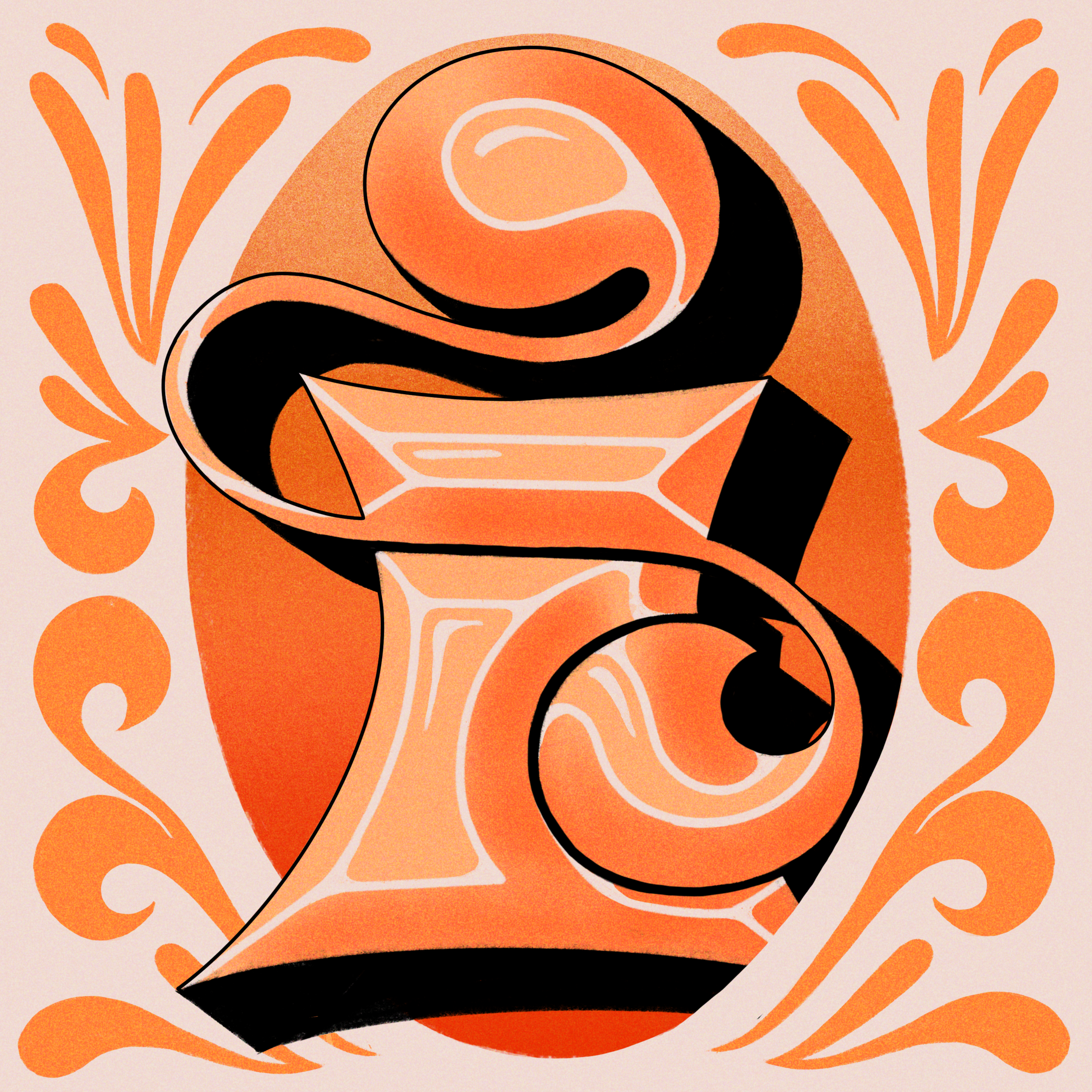
For my most recent alphabet, I was inspired by the interplay between nostalgic ornamentation and sleek futurism. Drawn to surrealism, sculpture, and intricate detailing—elements that I naturally gravitate towards—I sought to reimagine them through a digital illustration lens. By integrating new software and workflows, such as 3D modeling software, I also introduced a fresh dimension to my creative process.
Planning the alphabet
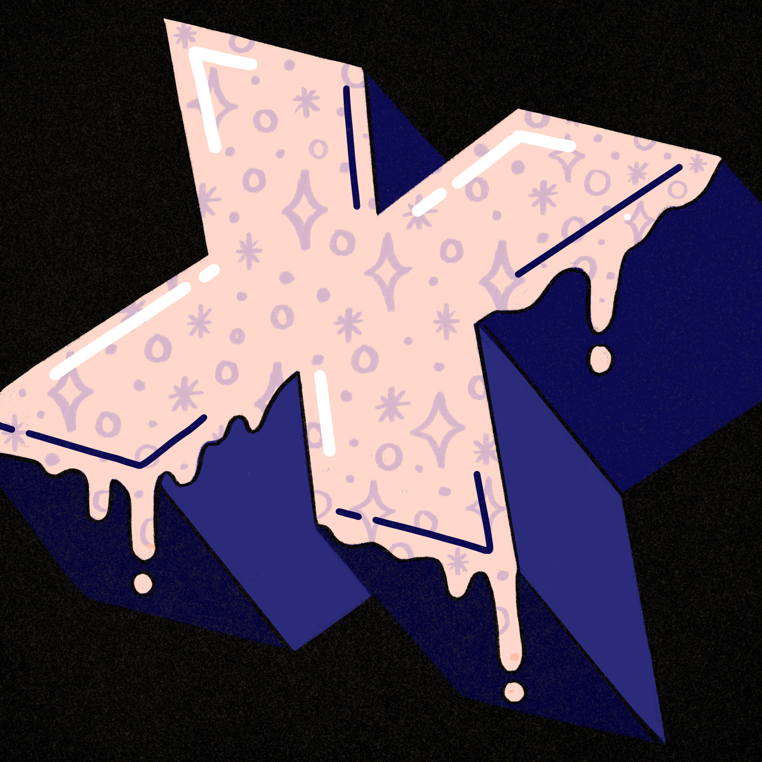
I started with initial rough sketches to get an idea of the styles I wanted to use. I knew I wanted to have a system in place to rotate between four general type styles throughout my alphabet while still being able to make each letter unique.

After deciding on type styles, I sketched out each letter. Some felt like they hit the mark on the first sketch, while others took quite a few sketches to go in the direction I was hoping for. I sketched out rough forms, knowing that I’d be able to work out details digitally.


Planning a color story
Knowing that I’d be doing letters every day for 36 consecutive days, it was important to land on general forms for my sketches before the challenge began so that I could focus on the details when it came to creating the final pieces. After landing on sketch forms, it was time to plan out a color palette.
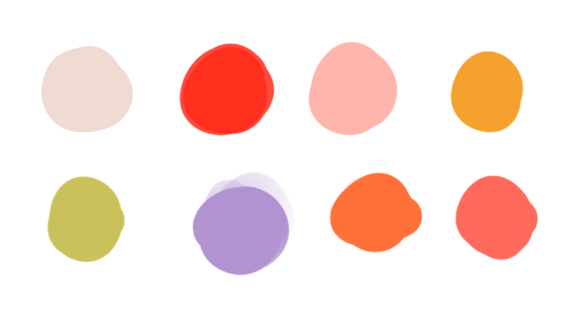
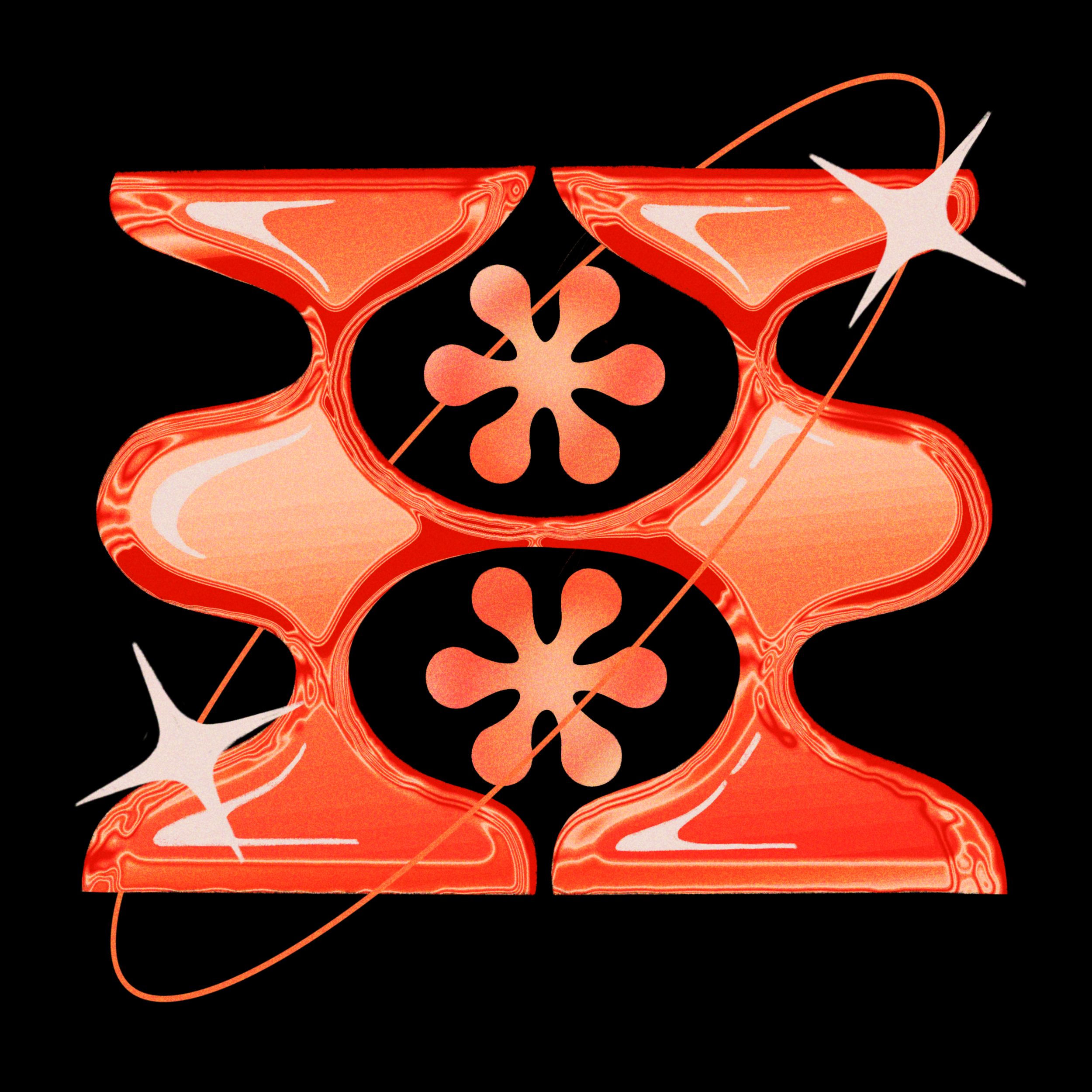
I drew inspiration for the palette from the general color story I had going on in my Instagram feed at the time. I also knew I wanted to start incorporating more purple and greens into my work, so I took this opportunity to start experimenting with those colors.


Building it all out
I completed the first four letters far before the challenge started to perfect the details in each of the four type styles. I then was able to use these first four letters as a guiding reference throughout the creation of the rest of the alphabet to make sure all 36 letters and numerals would feel cohesive as one family.
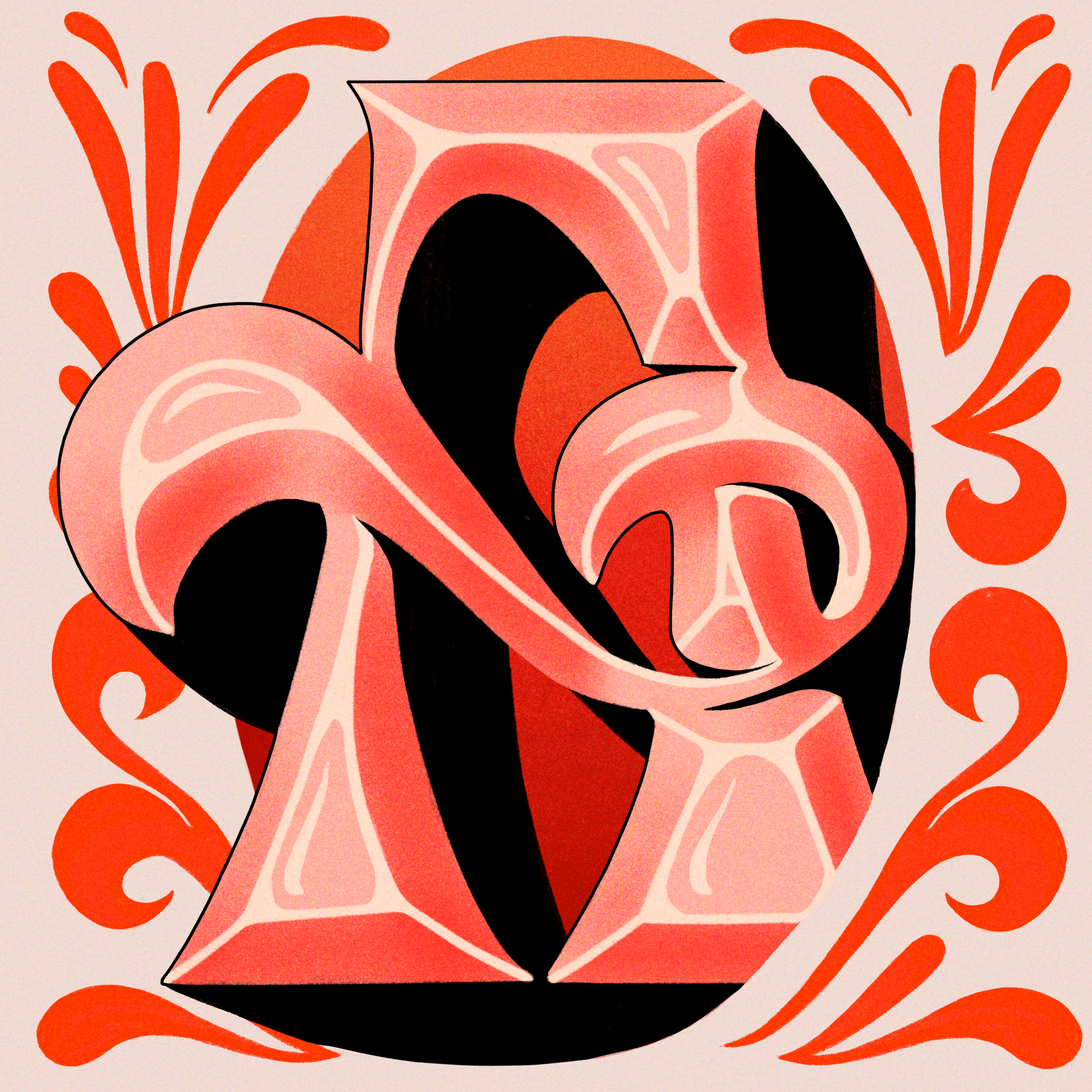

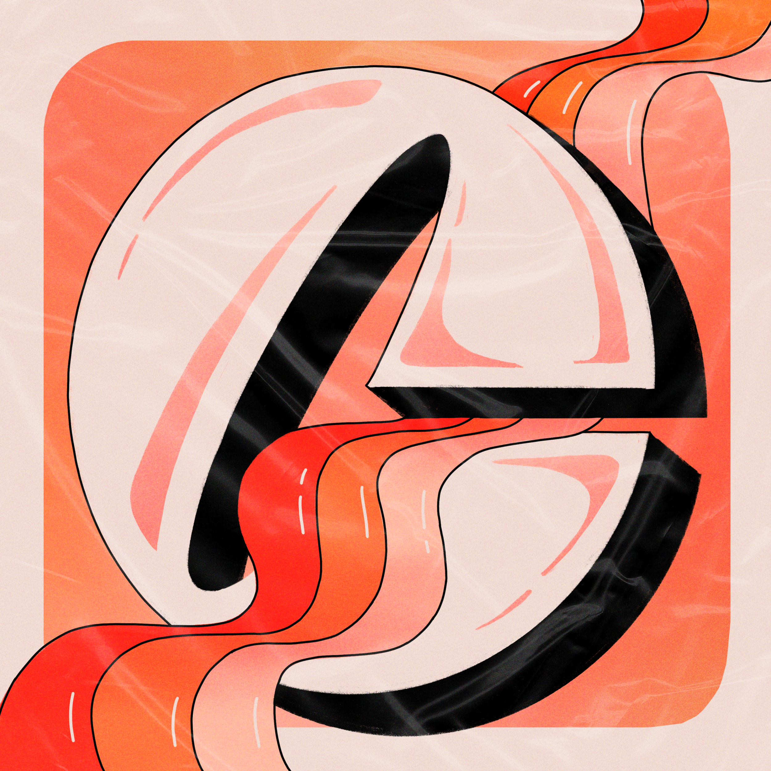


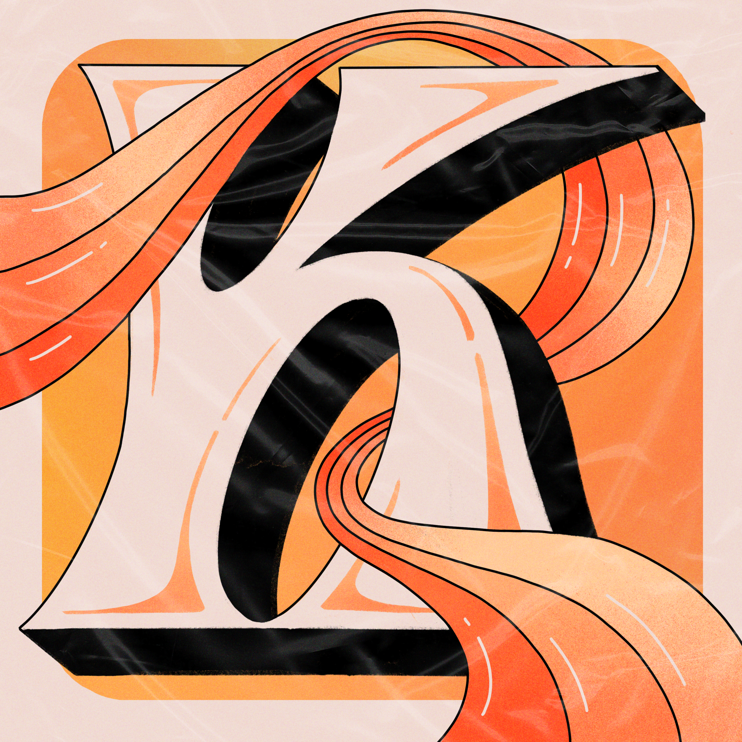

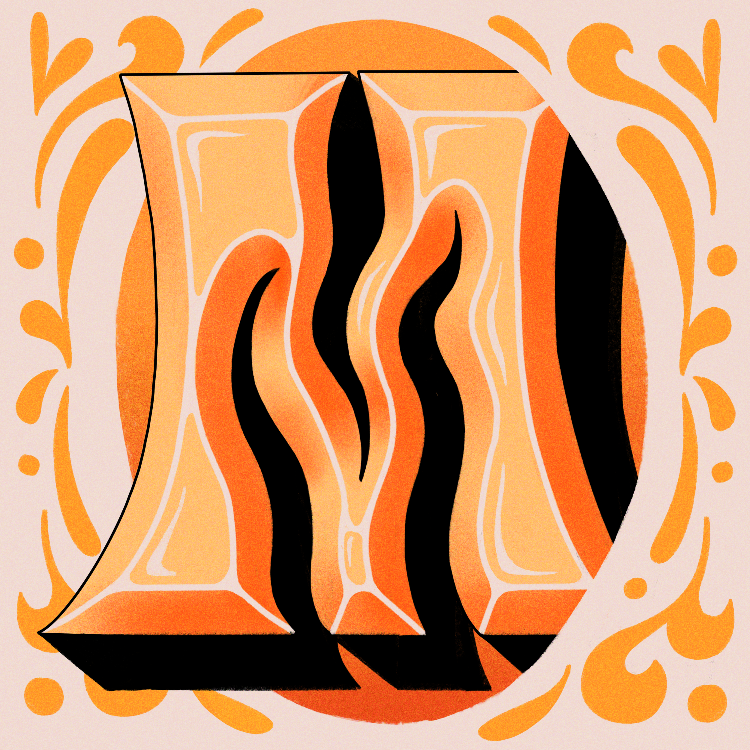

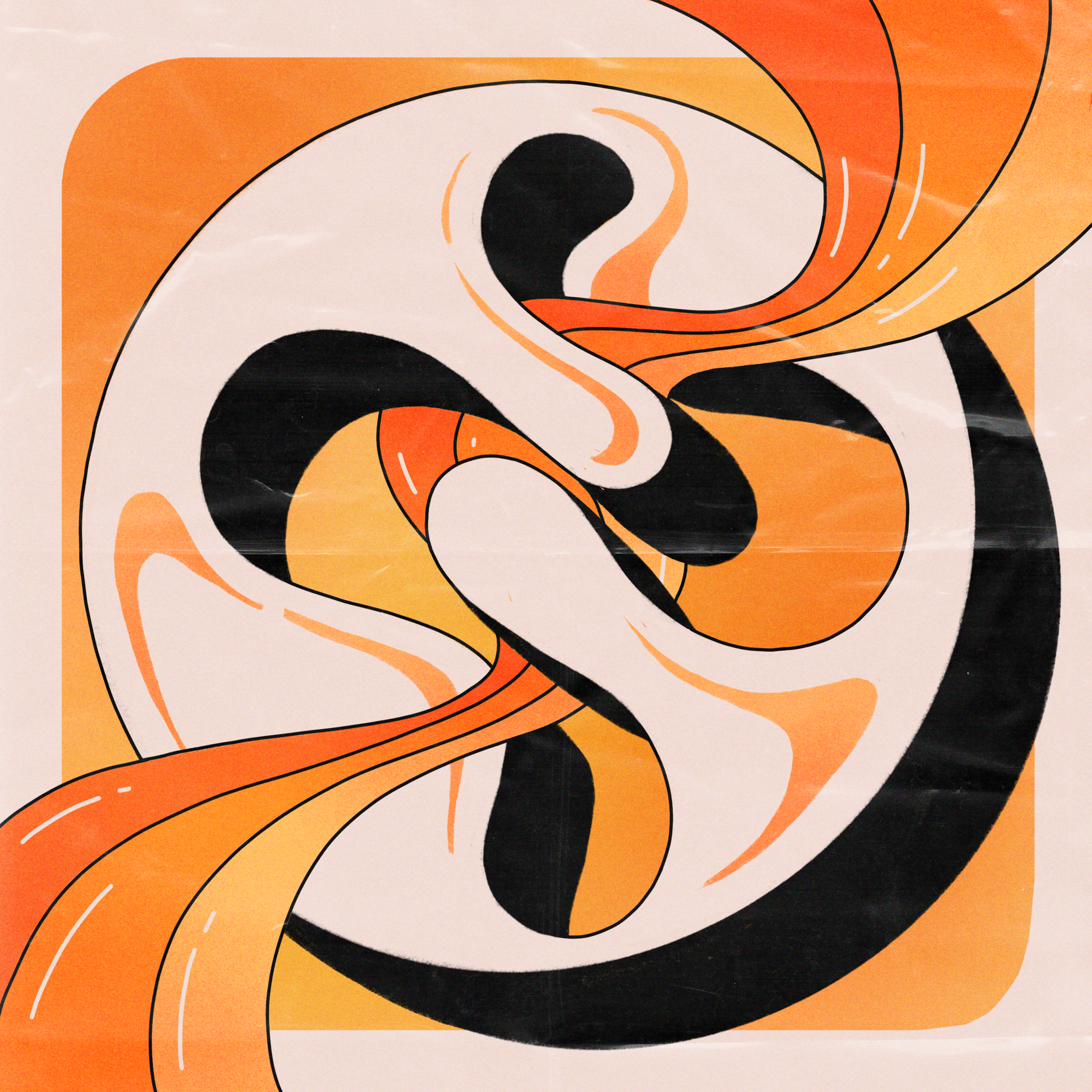

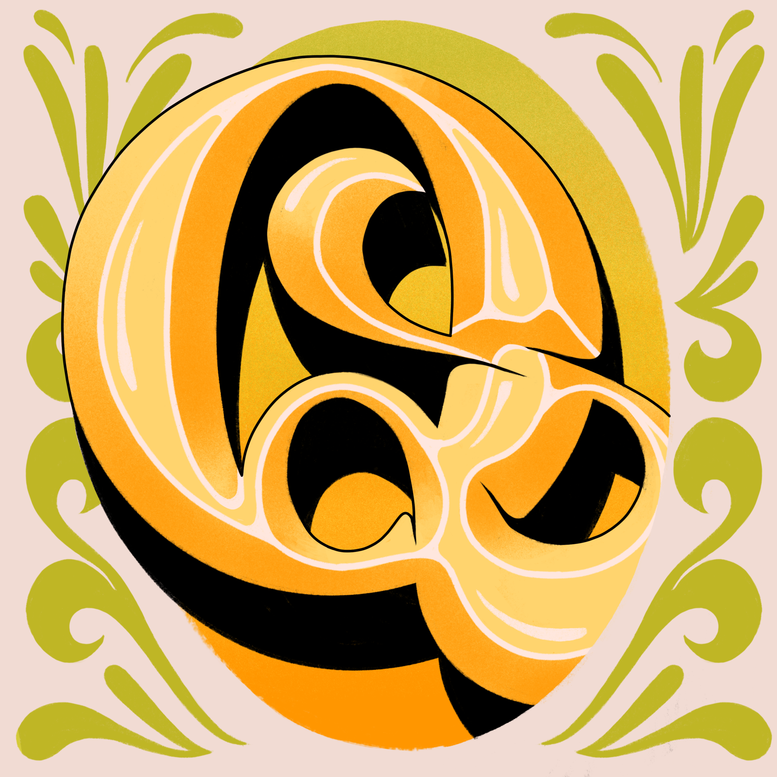

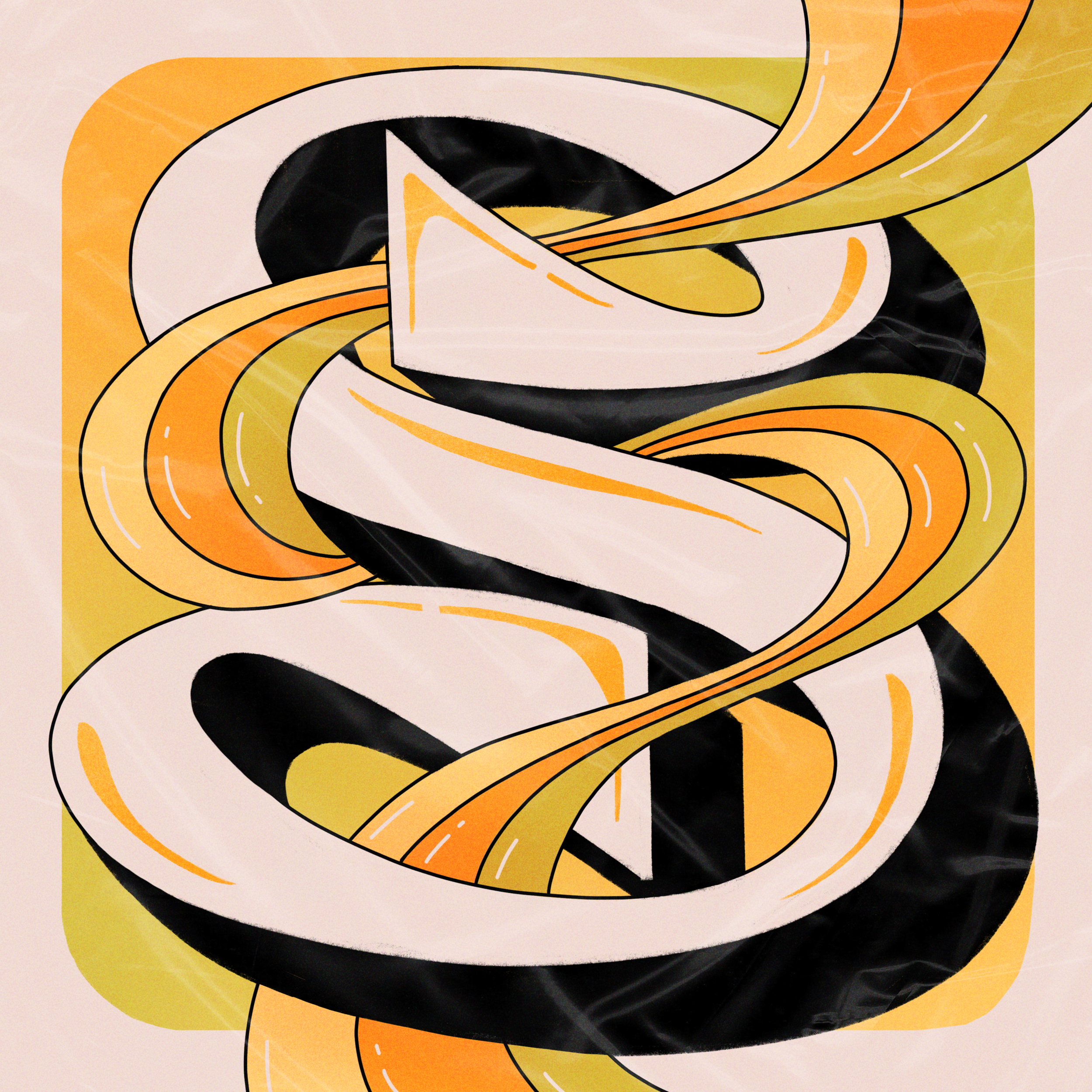
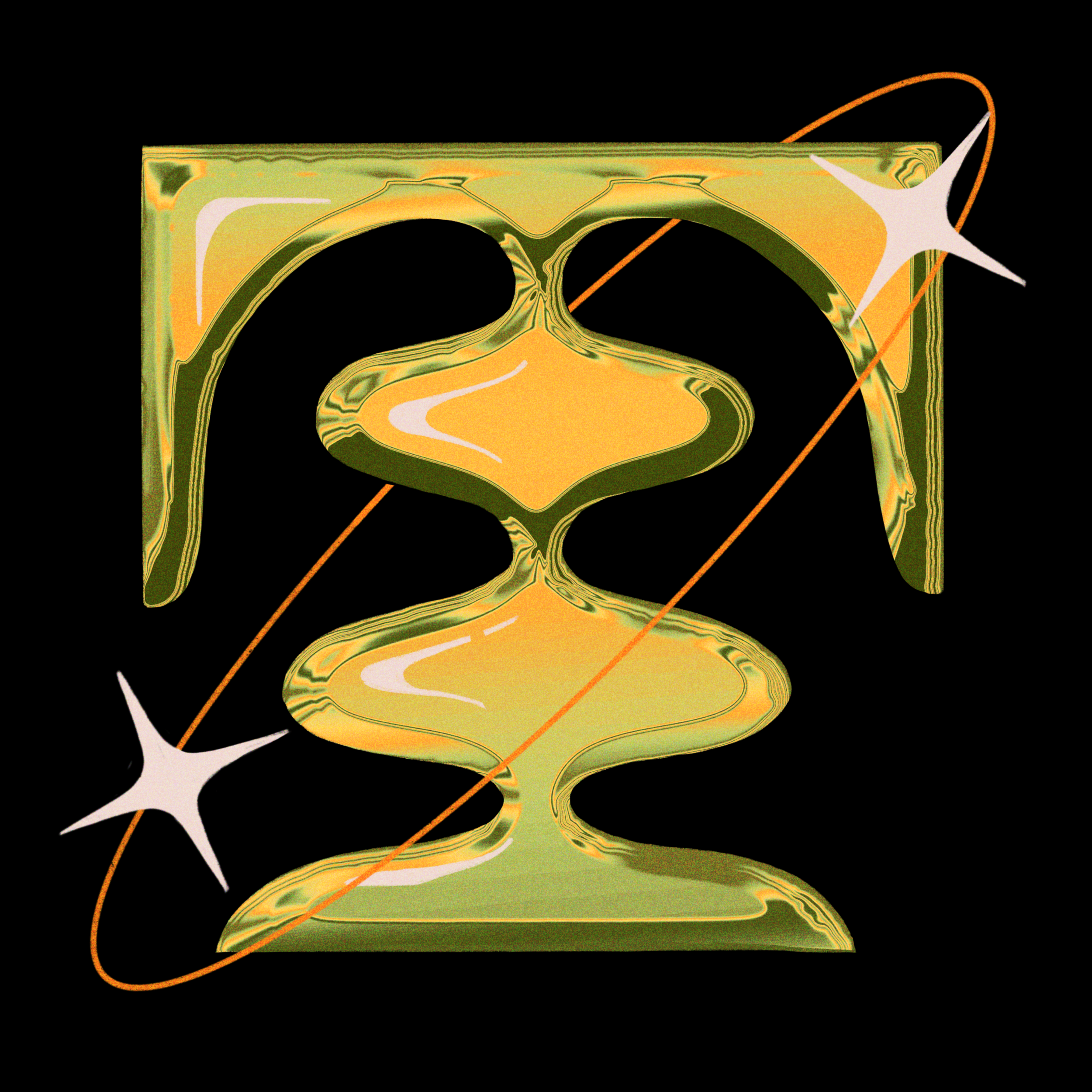
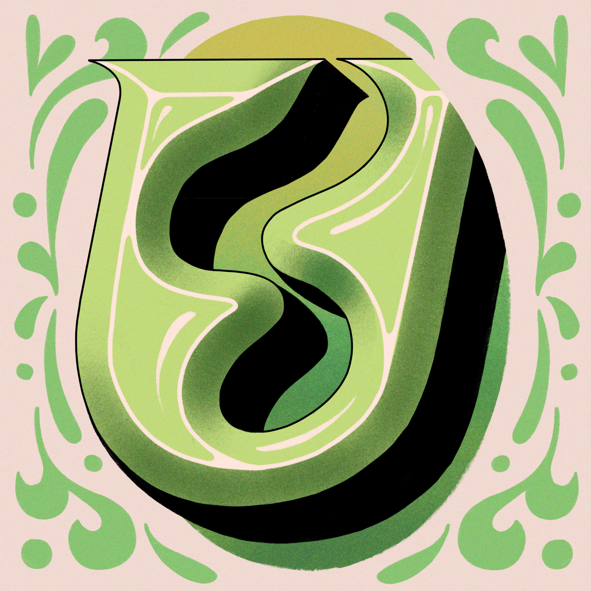

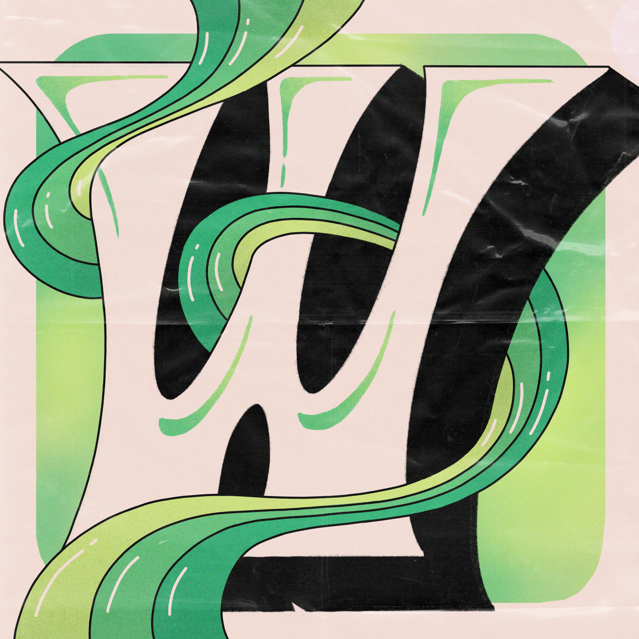

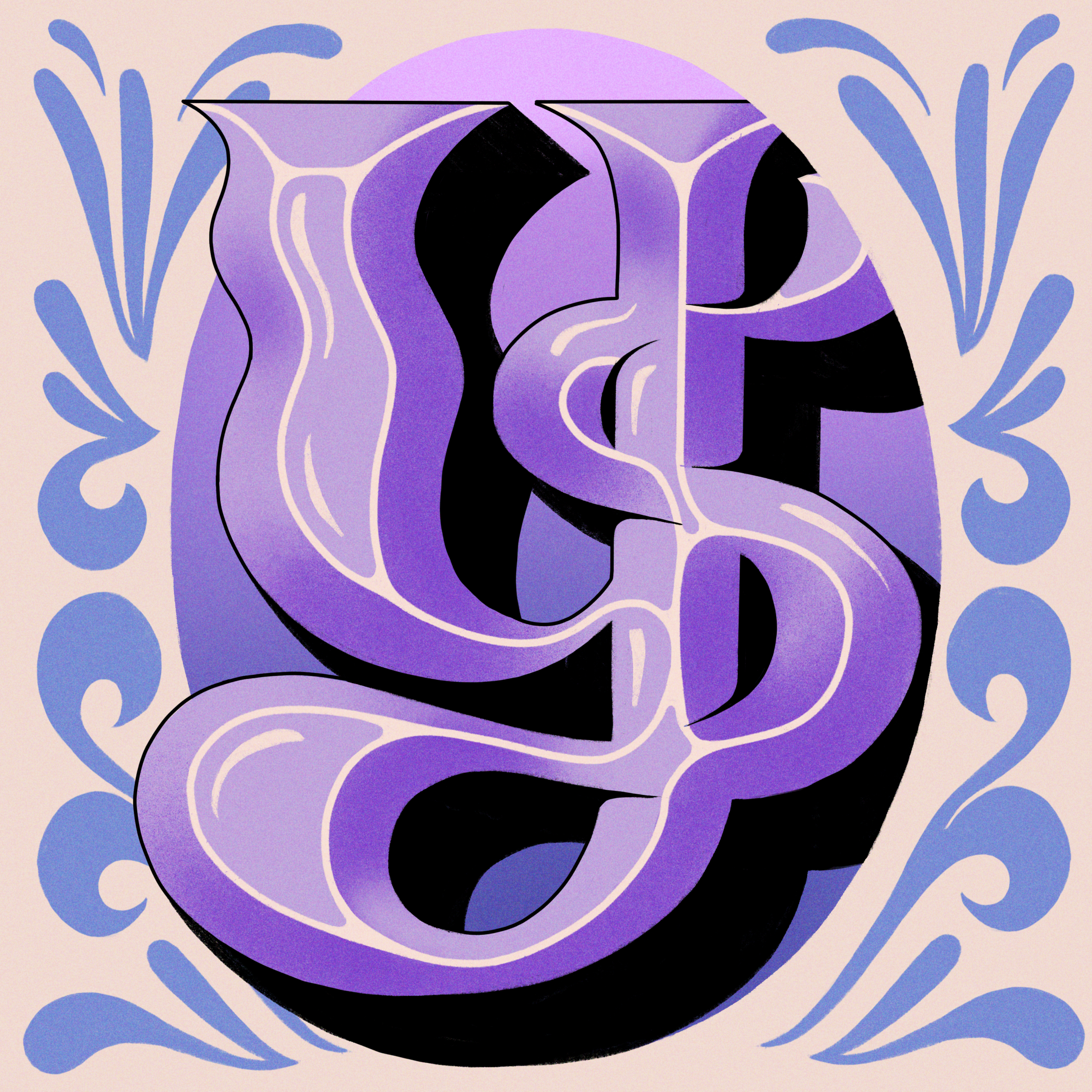

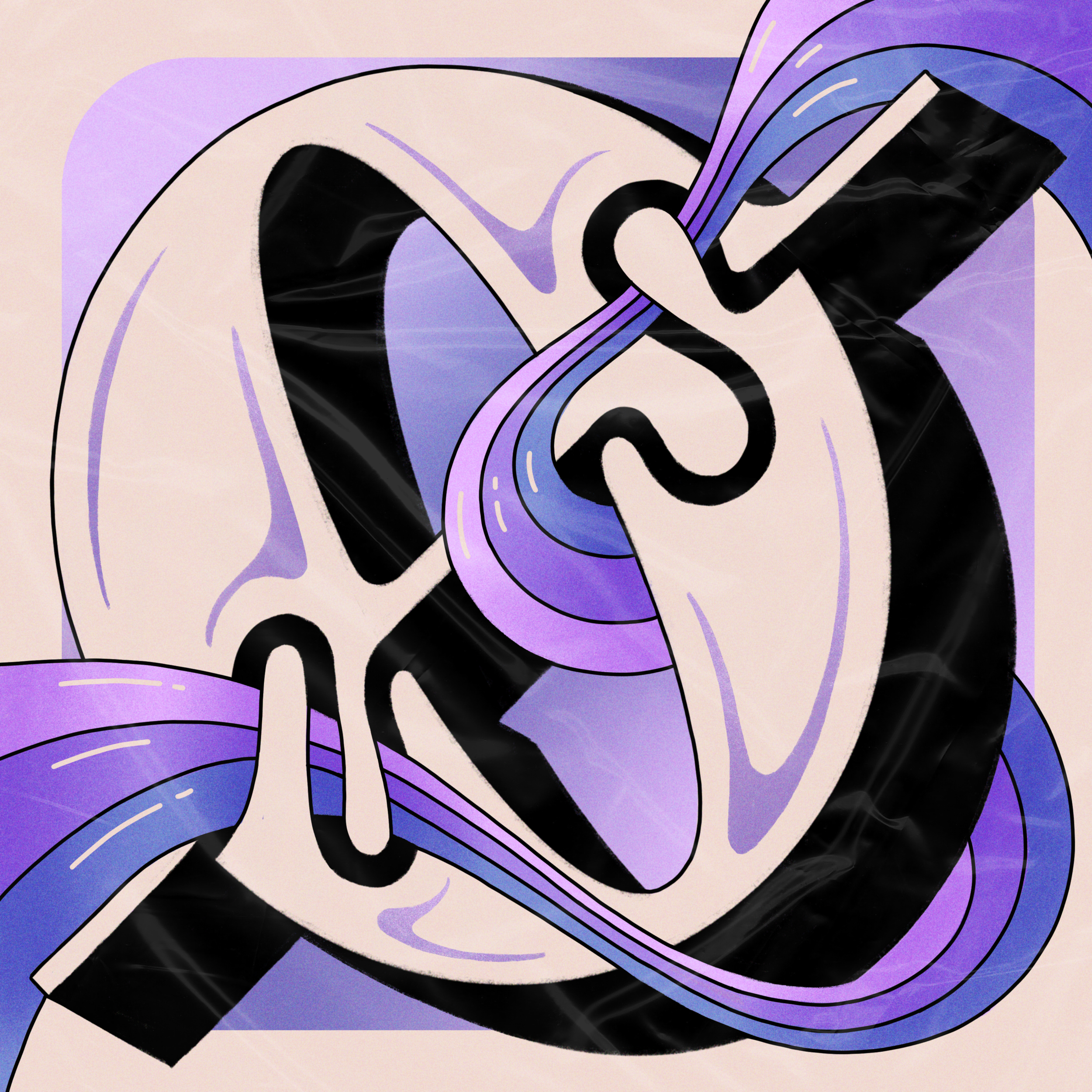

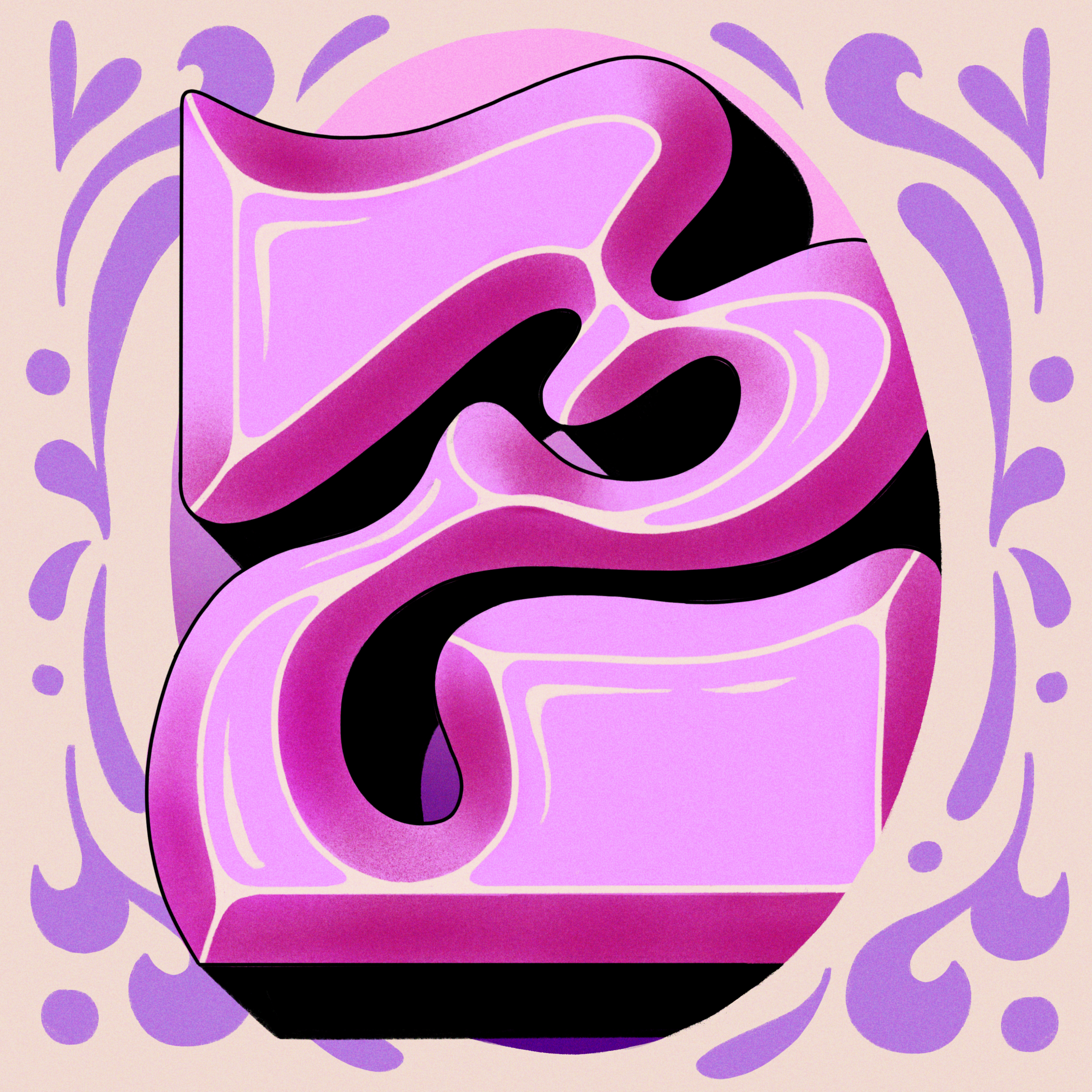
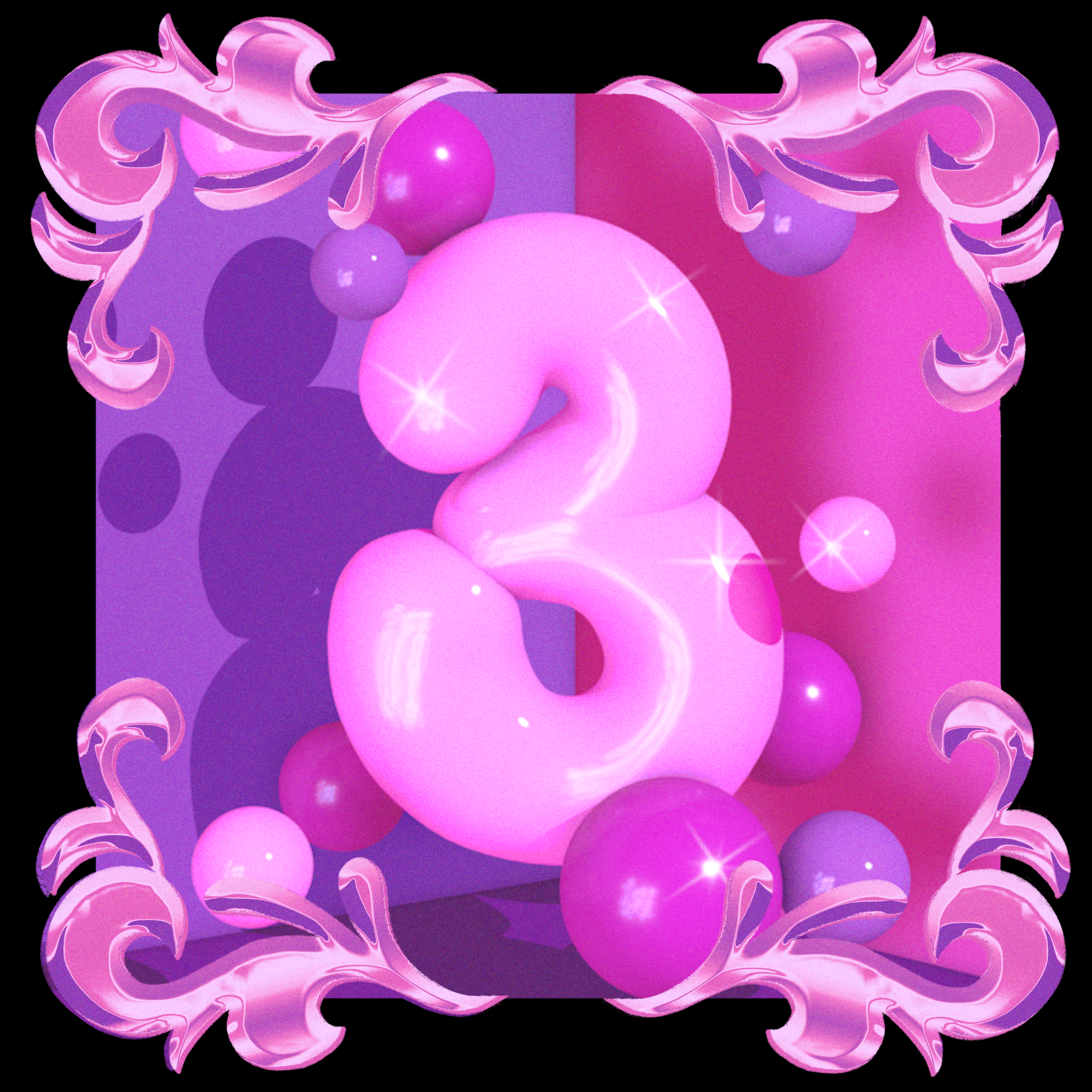
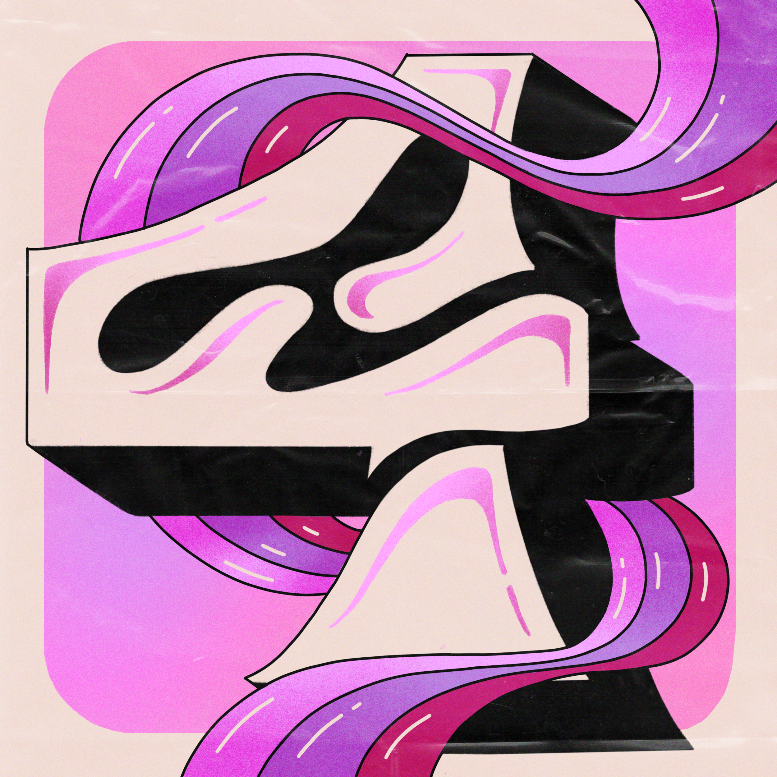

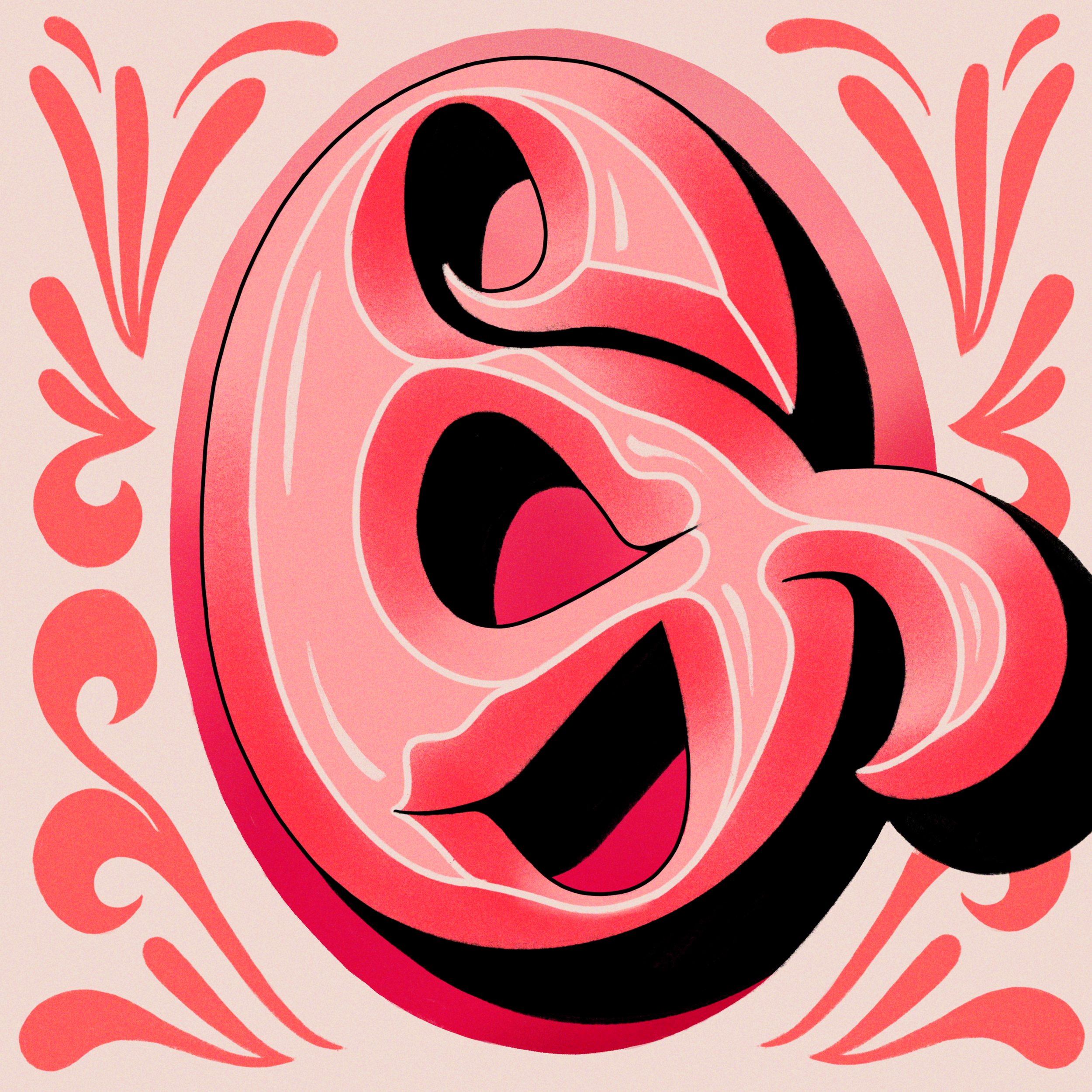

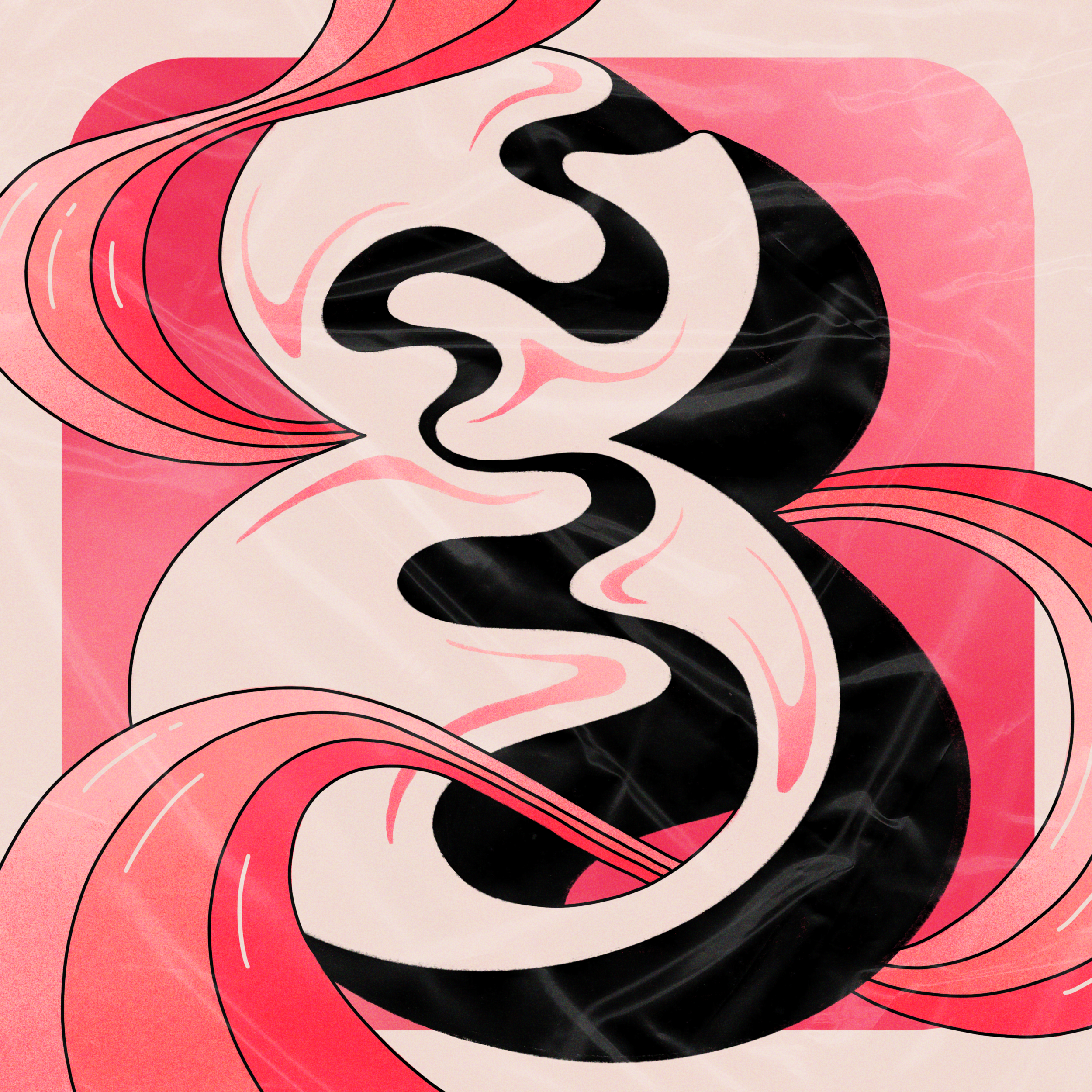

I used my color palette to create a gradient across the full final alphabet. To create the final pieces, I used a workflow that incorporated Cinema 4D, Photoshop, Illustrator, and Procreate. My letter “D” was selected to be featured on 36 Days of Type and Adobe Create on Instagram, and on Adobe Discover, the editorial section of Adobe.
ALphabet, 1st edition
For my first alphabet, I drew inspiration from my grapheme-color synesthesia—a sensory condition in which I instinctively associate letters and numbers with specific, unchanging colors. Each letter in my alphabet is rendered in the color I perceive it as, while additional visual elements reflect the emotions and characteristics I intuitively connect with these colors. By embracing these associations, I shaped each letterform’s personality and the environment it inhabits.